
Content Planning Tools With Analytics Integration
Content planning tools with analytics integration help teams decide what to publish, when to publish it, and why it matters. Instead of guessing, you can connect calendars, briefs, dashboards, and reports so every content decision is tied to real performance data. That means stronger topics, clearer priorities, and better return on effort.
For most teams, the real value is simple. A connected setup shows which blog posts attract traffic, which pages move people toward a sale, and where readers lose interest. When planning and reporting work together, content stops being a list of ideas and becomes a repeatable system for growth.
Why do these tools matter so much?
Many teams still plan content in spreadsheets and review results in separate analytics platforms. That split creates delays and weak decisions. Writers may not know what actually drives signups. Managers may not see which campaigns deserve more budget. A connected tool fixes that gap.
With integrated reporting, you can align content goals with business goals. A brand might want more organic traffic, more demo requests, or better retention. The right platform connects those goals to metrics such as page views, engagement time, conversions, and assisted revenue. This gives everyone a shared picture.
It also helps avoid vanity metrics. A post with high traffic can still fail if visitors bounce quickly or never act. On the other hand, a lower traffic article may generate qualified leads. Content marketing analytics for performance optimization makes those differences easier to spot early.
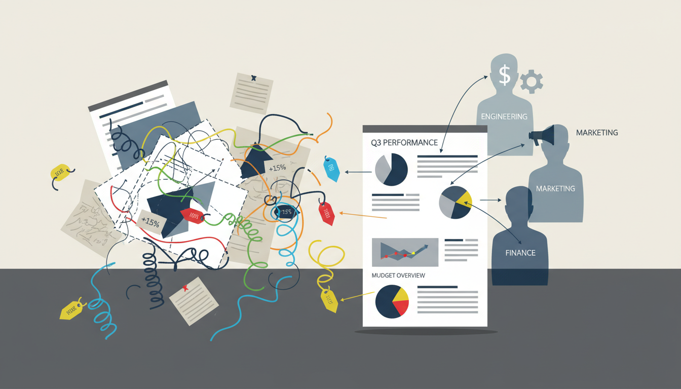
How do content planning tools connect to analytics and reporting?
Most modern platforms connect through direct integrations, APIs, or built-in dashboards. They often pull data from Google Analytics 4, Google Search Console, social platforms, CRM systems, email tools, and business intelligence software. Some also connect to heatmap and session recording tools for user behavior insight.
Once connected, the platform can match planning data with performance data. For example, a team can tag a blog post by funnel stage, topic cluster, audience type, and campaign. Later, reports show which categories drive traffic, engagement, pipeline, or revenue. This is far more useful than looking at raw traffic alone.
Better systems also support integrating content planning with user behavior analysis. They combine page metrics with signals such as scroll depth, click activity, drop-off points, and voice of customer feedback. That mix of quantitative and qualitative insight helps teams understand not only what happened, but why it happened.
Some tools now add AI features. These include anomaly alerts, trend detection, forecasting, and content recommendations. If engagement suddenly drops on a key landing page, the team can react quickly. If a topic cluster keeps outperforming others, the planner can recommend more content in that area.

What features should you look for?
Not every tool offers the same depth. Some are strong planners with light reporting. Others are powerful analytics platforms with only basic workflow features. The best choice depends on your team size, goals, and technical needs, but a few capabilities matter for almost everyone.
Core planning features
- Editorial calendar with role assignments and deadlines
- Content brief templates and approval workflows
- Campaign tagging by topic, audience, and funnel stage
- Asset tracking across blog, email, social, and web pages
Advanced analytics and reporting features
- Traffic, engagement, and conversion dashboards
- Journey analysis across pages and touchpoints
- Funnel analysis to find drop-off points
- Heatmaps or session insights for page behavior
- Custom reports for teams, channels, and campaigns
- AI alerts, forecasting, and anomaly detection
- A/B testing support or links to testing tools
These advanced content analytics and reporting features matter because content rarely works in a straight line. A reader may first find a blog post, return through email, then convert on a product page days later. A strong reporting layer helps assign value across that journey.
Which tools are often used by content teams?
Different brands mix different systems. CoSchedule, Asana, Monday.com, Airtable, and Trello are often used for planning and workflow. HubSpot combines planning, publishing, CRM data, and reporting in one environment. Semrush and Ahrefs support topic research and performance tracking. GA4 and Search Console remain common reporting sources.
For deeper user behavior analysis, teams may add Hotjar, Microsoft Clarity, or Contentsquare. Enterprise teams often connect Looker Studio, Tableau, or Power BI for custom reporting. The main point is not choosing the most expensive stack. It is choosing tools that share data cleanly and support daily decisions.
A smaller company may do well with Airtable, GA4, Search Console, and Looker Studio. A larger business may need a platform that connects content workflows to CRM stages, revenue data, and product analytics. The right fit depends on complexity, not just budget.
How can connected tools improve content strategy?
They improve strategy by helping teams prioritize the right work. Instead of publishing more content just to stay busy, teams can identify the topics, formats, and channels that move users forward. This leads to stronger planning meetings and better resource use.
Imagine you publish ten articles in one month. Integrated reports show that three articles produce most organic visits, two drive email signups, and one supports sales conversations. That information changes the next month’s plan. You can update winners, expand strong themes, and cut low value work.
Connected tools also make repurposing smarter. If a webinar drives strong engagement and assisted conversions, you can turn it into blog posts, short videos, social clips, and email content. Because the reporting is linked, you can compare results across formats rather than relying on opinion.
Teams also benefit from real-time monitoring. If a campaign underperforms, they can adjust headlines, calls to action, or internal linking quickly. If performance improves after a test, they can scale that pattern across similar content. Measuring content ROI through analytics tools becomes more practical when the data is visible inside the planning process.
What does a good workflow look like?
A useful workflow connects strategy, production, publishing, and review. Each step should feed the next. That way, analytics is not something checked at the end of the quarter. It becomes part of everyday planning.
- Set a clear goal, such as leads, trials, or support deflection.
- Map audience intent and choose topic clusters.
- Create briefs with keywords, audience notes, and success metrics.
- Publish and tag each asset consistently.
- Review dashboards weekly and campaign reports monthly.
- Update, expand, test, or retire content based on findings.
This cycle sounds basic, but consistency is what creates results. A team that reviews data every week will usually outperform a team that waits for a quarterly report. Small improvements add up over time.
What mistakes should you avoid?
The biggest mistake is tracking too many numbers without a clear question. If your goal is lead generation, page views alone are not enough. If your goal is awareness, direct revenue may not tell the full story. Match your metrics to the job the content is supposed to do.
Another common problem is poor tagging. If articles are not labeled by campaign, topic, funnel stage, or audience, reports become messy and hard to trust. Teams then stop using the data. Good naming rules and taxonomy save a lot of frustration later.
It is also risky to ignore qualitative signals. Heatmaps, search intent reviews, customer comments, and sales feedback often explain why a page is underperforming. Numbers show the symptom. User insight often reveals the cause.
Finally, do not expect one dashboard to answer everything. Executives may want revenue and pipeline views. Editors may want engagement and ranking trends. Writers may need page-level feedback. The same data can support different decisions when reported clearly.
How do you measure ROI in a realistic way?
Start by defining value. For one business, value may be a sale. For another, it may be a booked call, a qualified lead, or reduced support demand. Once value is defined, connect content touchpoints to that outcome as closely as possible.
Use direct and assisted metrics together. Direct metrics include form fills, purchases, or signups from a page. Assisted metrics show when content helped earlier in the journey. This is important because many buyers visit several pieces of content before taking action.
Look at efficiency too. If one content series brings steady traffic and leads for months, its long-term return may beat a short paid campaign. Good reporting helps reveal this compounding effect. Over time, teams can compare creation cost with business impact and invest more wisely.
FAQ
Are these tools only useful for large marketing teams?
No. Small teams often benefit the most because connected planning and reporting reduce wasted effort. Even a simple setup can show what deserves attention.
Do I need technical skills to use analytics integration?
Basic setups are often straightforward, especially with common tools like GA4 and Search Console. More advanced dashboards may need help from an analyst or developer.
Can these tools help with old content, not just new content?
Yes. Integrated reports are excellent for content audits. They help you refresh strong pages, merge weak pages, and remove content that no longer serves a goal.
What is the best first step for getting started?
Pick one business goal, connect your planner to your main analytics source, and create a simple dashboard for traffic, engagement, and conversions. Start small, then expand as your team learns.